Billions are lost annually due to UI and UX bugs

Scheduled automated testing can prevent those losses.

30% revenue loss due to a faulty checkout in 2023 Black Friday sales.

An e-commerce business we track recently lost 30% out of 7 digit profit last Black Friday. That's at least 6 digits down the drain.

The cause? A faulty checkout. Something preventable. Something fixable. Something that should have been tested extensively. If only they knew about it in time.

Below we show three common examples we see often on the web. They go from mild to catastrophic and illustrate how revenue loss occurs and how easily preventable it is with Buglab.

Your cart
  • Item you like: $149.99
  • Item you love: $219.49
  • Item you need: $49.19
  • - - -
  • Total: $418.67
purchase
Delivery within 24 hours.

Oops! Something went wrong.

500
Internal server error

30% revenue lost

Annoying but usable

It works. It just feels (and looks) bad.

Nothing to fuss about. Just bad execution.

Sometimes a single line of code can lead to some annoying UI. In this example, the button is completely functional, just not something to write home about.

It happens to the best of us. What is not suppose to happen is to figure it out via an email from your customers.

Most likely cause: The CSS display property is not set properly.
Summer cohort application
SEND YOUR APPLICATION
We found this particular issue in a real website application form during a demo meeting.

A few months after the company fixed the issue and now works and looks as intended.

Confusing but likely usable

It kind of works, but is far from clear.

Confusing UX. Still possible to navigate.

In the modern web all content should be responsive in order to be consumed on a wide range of devices and screens. Sometimes a small change in the screen size can lead to rearranging of key elements or other major UX issues.

You can most likely deduce the order of buttons and their corresponding descriptions, but deducing how your website works is not a job for your users.

Most likely cause: Underdeveloped responsive design.
We found this issue in the process of booking a meeting with a company. The issue was "fixed" by completely removing the buttons a few weeks latter. Book a meeting Monday Available time slots: 09:45AM, 02:30PM
BOOK
Tuesday Available time slots: 10:30AM, 04:00PM
BOOK
Wednesday Available time slots: 11:45AM, 02:30PM, 04:00PM
BOOK

Completely unusable

Utterly broken CTA (Call To Action) button.

Completely unusable interface.

In some cases several small issues can group up to give a web page a nice unusable finish.

The scariest part is that we've been seeing those issues on registration forms and pricing pages. A small UI/UX errors leading to completely unusable content and subsequently revenue loss.

Try clicking the button.

Most likely cause: Positioning and spacing misalignment and faulty z-index values.
Join our platform
This issue was found during a negotiation process with a VC fund in mid 2023. This issue still persists on their website (Q1 2024).
This example is completely illustrative. The real issue was found on mobile screen sizes. The vast majority of web browsing is done using a mobile device as you already know.
LEARN MORE

How Buglab can help you

Buglab will help you catch those bugs (and many others) before they catch your customers.

A smart visual testing tool.

Building a website or platform for your customers is hard work. Keeping it up and running is actually even harder.

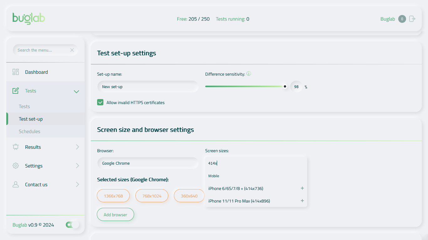
Our team knows this because we've been building complex web products for over a decade. Buglab was born out of necessity to speed up and secure our testing process. None of the testing tools on the market could get the job done so we built our own and started improving it based on customer feedback.

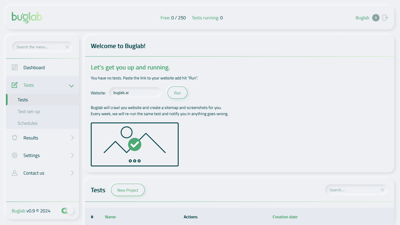
Start in minutes image

The solution

Ensure UI/UX quality and consistency with ease.

Spellcheck for UI.

A no-code automated visual testing solution.

We know how time-consuming and expensive manual QA labour is. We know people are prone to error and they hate doing repetitive tasks over and over again.

Automated testing is hard to set up and doesn't check the way your websites and apps actually look to your users.

And often it's not even your team making the mistakes. It's a new version of a library you are using, a new version of the CMS you employ, or an update to the user's browser. The list goes on and on. Buglab is here to ensure it doesn't happen to you again.

Start in minutes image